
When Tesla first introduced the Model S and its massive center dashboard, its design was instantly likened to that of Apple’s iPad. Sleek, modern and easy to use, it was unlike anything drivers had experienced in a car.

(Bottom: Huang’s redesigned dashboard)
But it has been a few years, and though the California based manufacturer is working on a redesign, Alex Huang of Y Media Labs was tired of waiting.
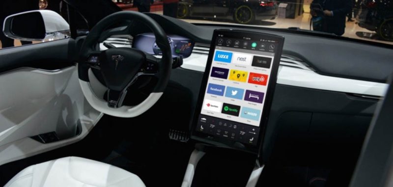
“The current dashboard UI was quite revolutionary when it first came out, but it’s definitely showing its age with its skeumorphic visual cues,” described Huang. “Buttons looks like physical buttons, while icons are given embossed 3D treatments.”
So, he came up with his own redesign, moving the layout away from something resembling the physical dashboard drivers are used to and closer to the simplified circles of a touch-screen phone. With particular focus on making it easy to use third party apps, Huang’s design offers a different take on Tesla’s original idea.
(See Also: Tesla Autopilot Coming for Model S & Model X This Week)
Check out the photos of the redesigned user interface below, and let us know in the comments if you’d prefer to use a dashboard designed by Huang or the one Tesla has stuck with all these years.
[button color=”black” text=”white” url=”http://www.dupontregistry.com/autos/results/tesla/model–s” window=”_blank”]Model S Listings For Sale[/button]
[separator type=”thick”]
Gallery


[separator type=”thin”]
(Source: Y Media Labs)
[separator type=”thick”]